Professional work · Web app / SaaS · UX research · Design systems · Web design
Olive — simplifying complex software evaluations from RFP to TCO
Joining a software sourcing platform after its soft launch to restructure the information architecture, redesign requirement management, expand vendor comparison, and unify the interface end to end.
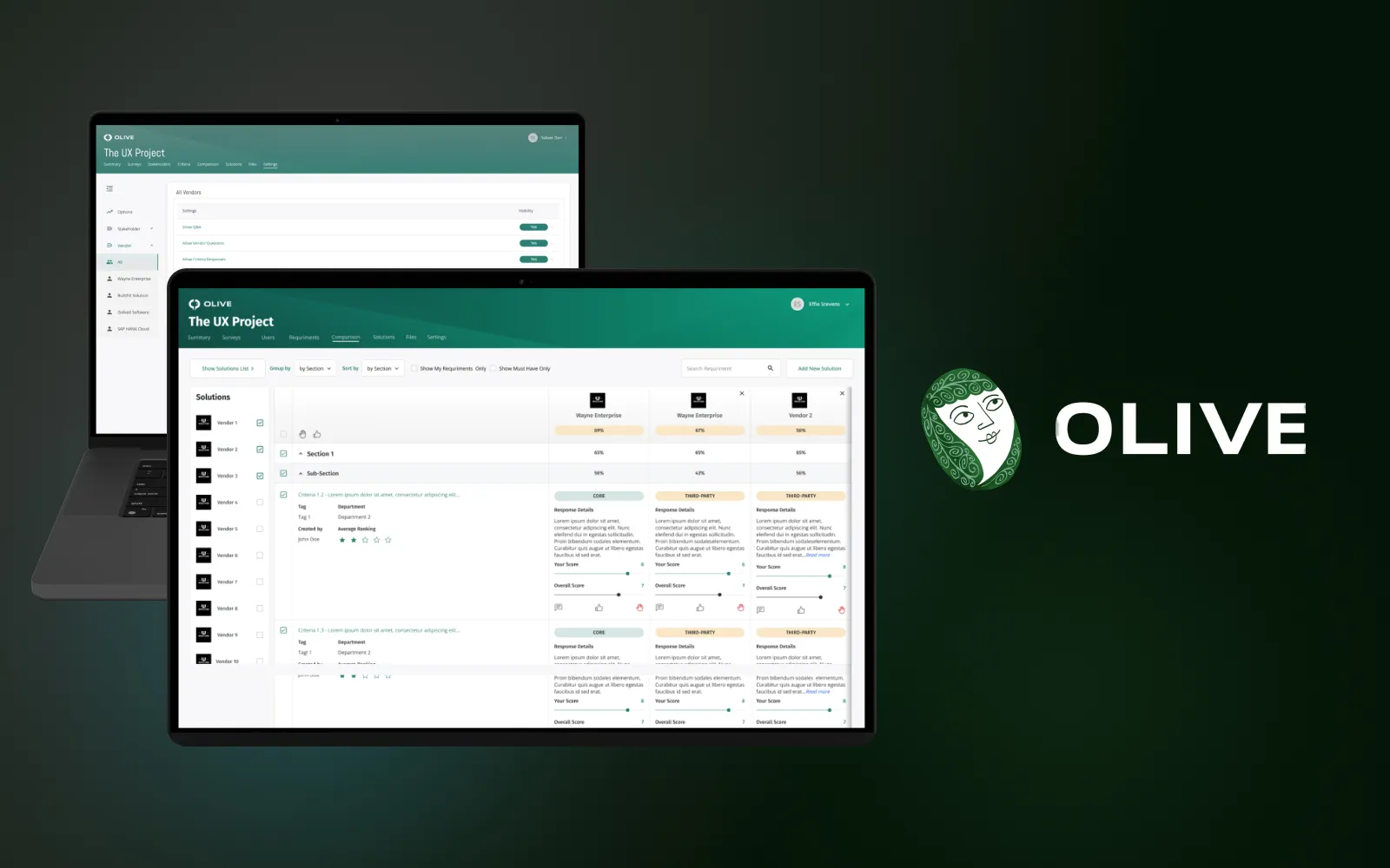
I joined Olive after its soft launch to restructure the information architecture, improve requirement management, expand vendor comparison, and unify the interface across the end-to-end software sourcing workflow.
At a glance
- Led user research, information architecture, user experience design, interface design, wireframing, prototyping, and design-system work.
- Worked directly with early users to identify friction in navigation, requirements, comparisons, and feature discovery.
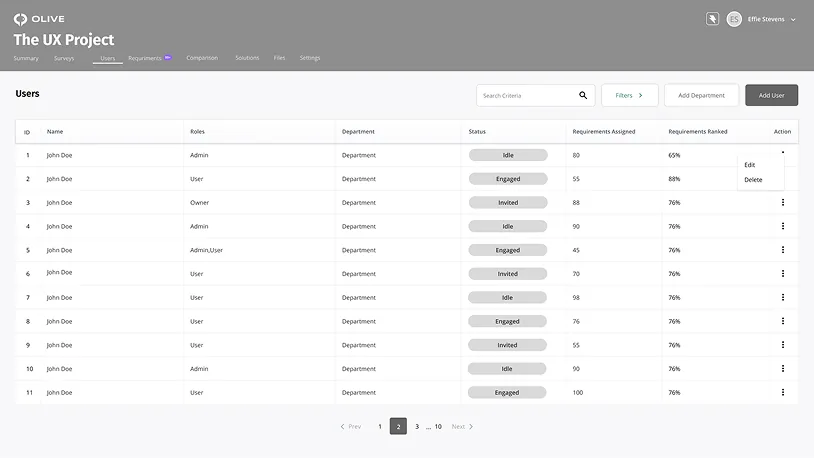
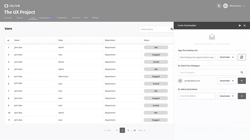
- Redesigned the experience across project summaries, surveys, user requirements, vendor comparison, solutions, files, and settings.
- The revamped product received strong feedback and was recognized with G2 awards for Best Usability and Easiest Admin Panel.
The context
Olive is a software sourcing platform designed to give teams control of the decision-making process — from RFP through total cost of ownership. I joined after the product’s soft launch, when real users were beginning to expose the gaps between the product’s capabilities and the clarity of its experience.
I started with team discussions to understand what alpha users were struggling with, then moved into direct interviews. Those conversations helped prioritize the areas with the greatest effect on task completion and day-to-day administration.
My role: Research, user interviews, information architecture, user experience design, interface design, wireframing, prototyping, and design-system development. I worked with users and the product team to turn complex sourcing workflows into a clearer and more consistent product.
The problem
The information architecture had become overly complex, making navigation and content discovery difficult. Users could not move smoothly through the product, and newly added features were easy to miss.
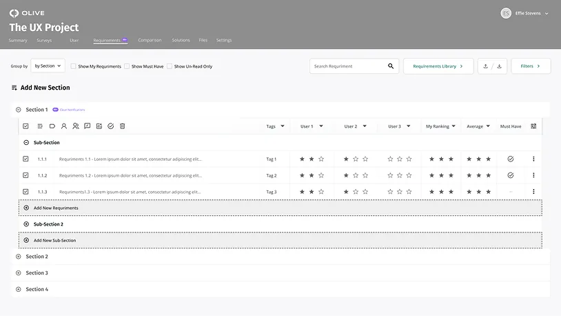
Requirement management was especially challenging: multi-level requirements were difficult to display, organize, and maintain. Vendor comparison was also constrained to three companies, which limited comprehensive evaluation. Across the product, inconsistent visual patterns increased cognitive load and weakened trust in the experience.
Key decisions
- Restructured the product around a clearer hierarchy of project tasks and used stronger visual cues, progress indicators, and calls to action to guide users through the workflow.
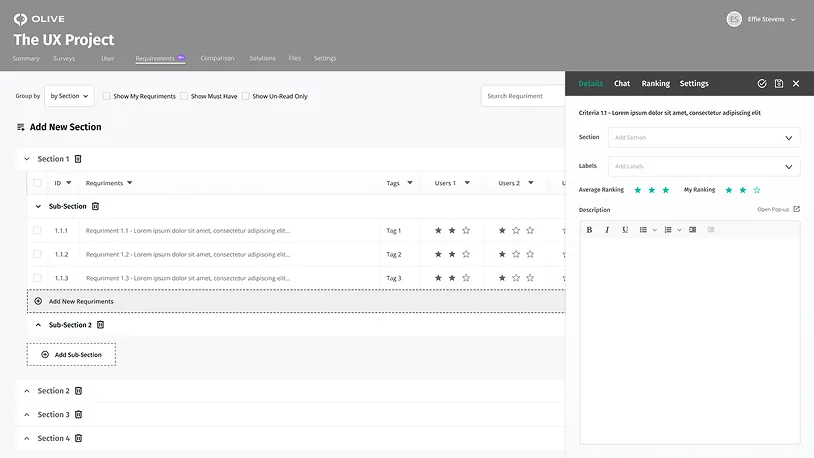
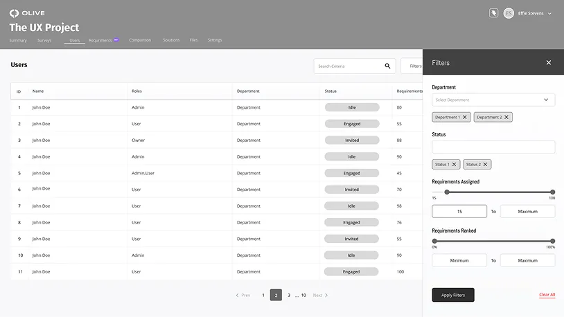
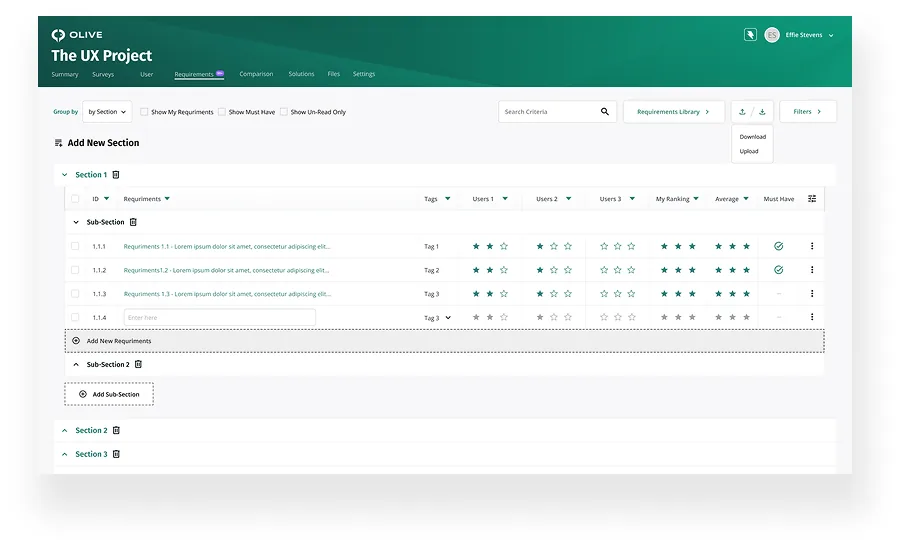
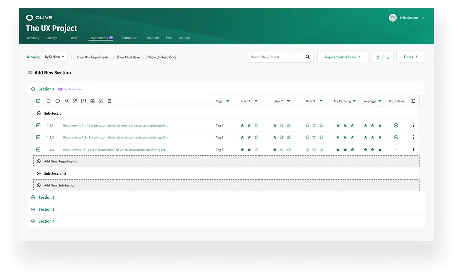
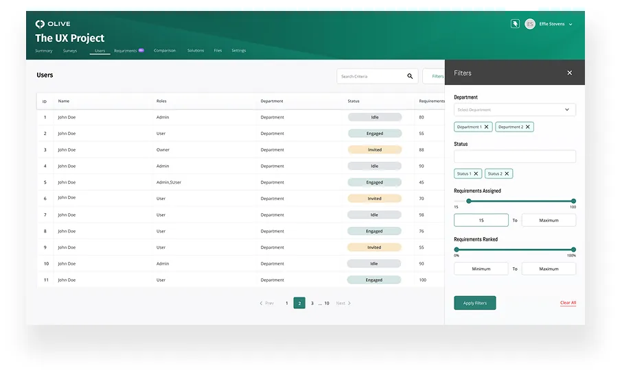
- Redesigned multi-level requirements with collapsible sections, clearer nesting, tags, filters, and drag-and-drop interactions so complex lists could remain understandable and manageable.
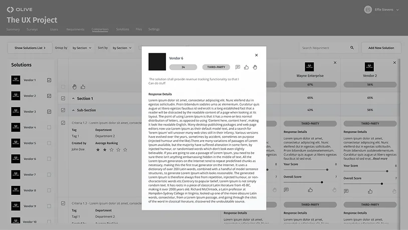
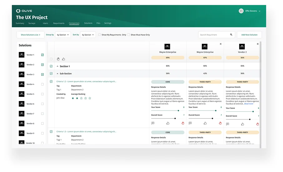
- Expanded vendor comparison beyond three companies through a horizontally scrollable or tabbed model, allowing broader analysis without compressing the information into an unreadable layout.
- Improved feature discovery with badges, banners, and visible states so users could recognize what was new and where to act next.
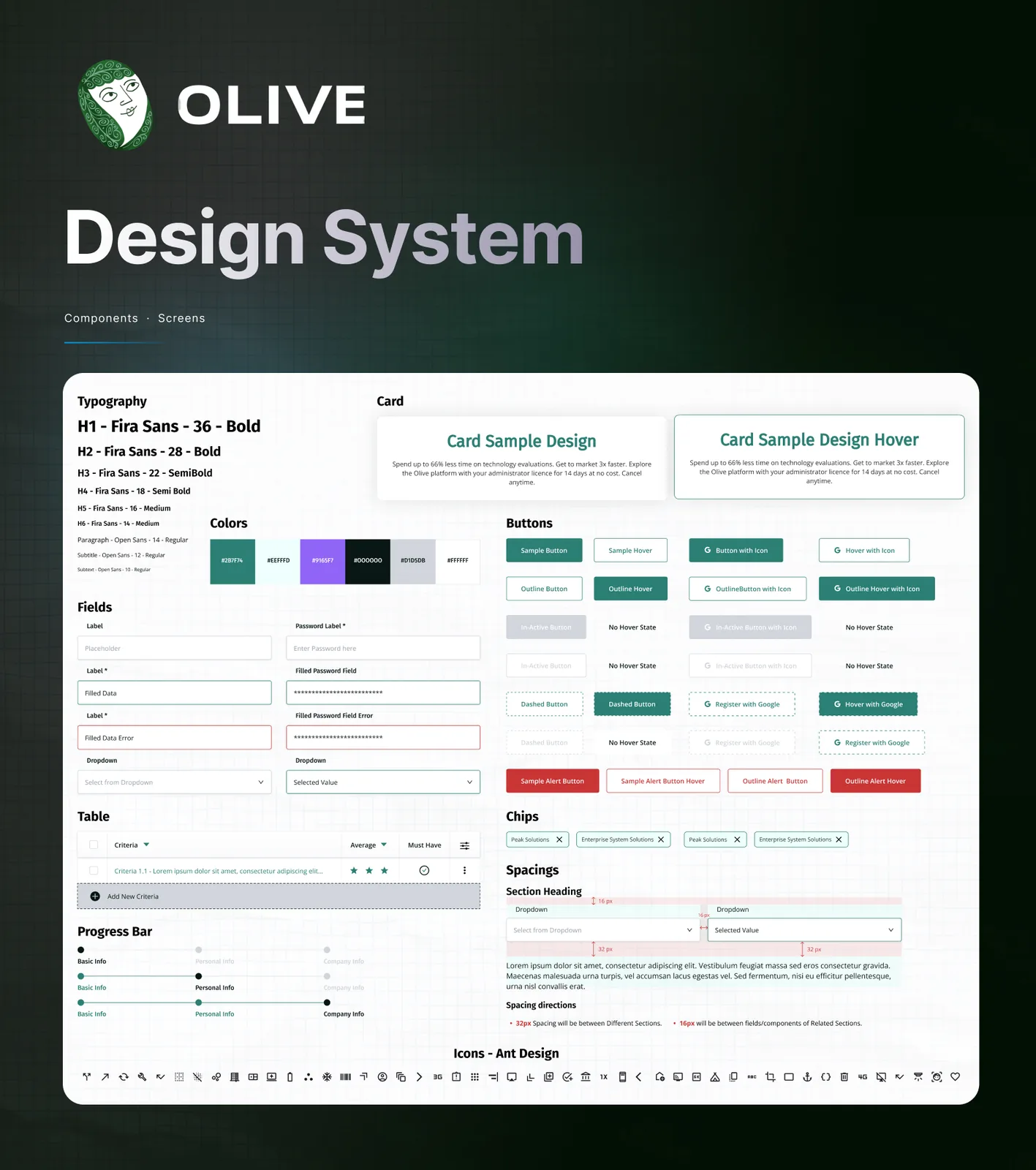
- Created a cohesive design system covering typography, color, spacing, cards, buttons, form fields, tables, progress indicators, chips, alerts, and interaction states.
- Balanced visual distinctiveness with professional credibility, using olive green and purple as the foundation of a modern B2B interface.
Design System
Brief Design System Visual for Olive
What shipped
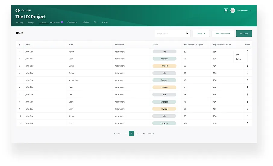
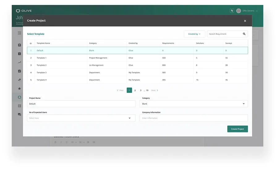
A redesigned sourcing platform spanning the project summary, surveys, user requirements, requirements library, comparison views, solution evaluation, files, and settings. The work introduced clearer hierarchy, richer filtering, more manageable nested requirements, expanded comparison behavior, and stronger guidance throughout the workflow.
The final system included reusable components and high-fidelity screens for the major product areas, giving the team a consistent foundation for ongoing feature development.
Impact
The redesign created a more cohesive and user-friendly experience, helping users navigate complex evaluations and manage detailed requirements with less friction. It also gave the product team a shared visual language for expanding the platform without introducing new inconsistencies.
The revamped product received strong feedback and was recognized with G2 awards for Best Usability and Easiest Admin Panel — an outcome that reinforced the value of the user-centered restructuring and interface work.