Professional work · Mobile apps · UX research · Design systems
Edkasa — reimagining an ed-tech platform for more motivating learning
Leading the end-to-end redesign of Edkasa's mobile learning experience — using stakeholder and student research to simplify navigation, make progress visible, and create a scalable design system for iOS and Android.
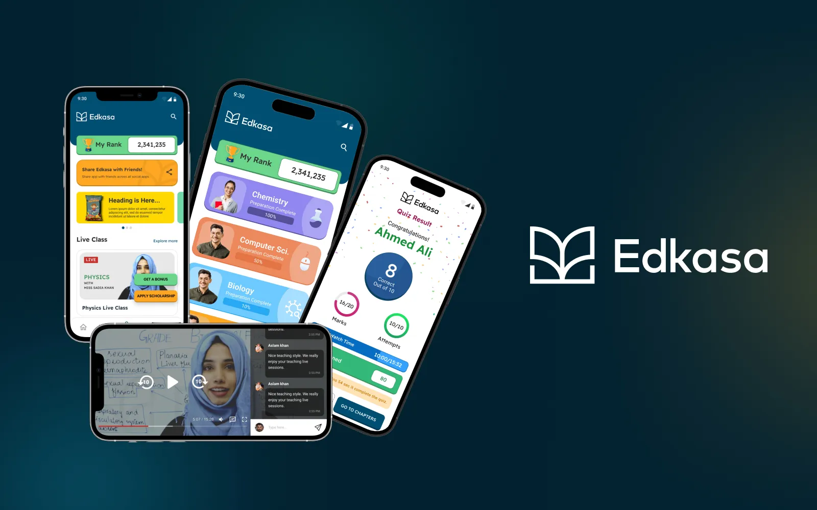
I led the end-to-end redesign of Edkasa’s mobile learning experience — using stakeholder and student research to simplify navigation, make progress visible, and create a scalable design system for iOS and Android.
At a glance
- First and only product designer on the team, working closely with students, stakeholders, developers, and finance experts
- Owned research, user interviews, user experience design, interface design, wireframing, prototyping, and the design system
- Focused the redesign on navigation, progress tracking, motivation, personalized learning, live classes, and teacher support
- Designed a reusable mobile system that could support the core product and future platform expansion
The context
Edkasa is a fast-growing Pakistani ed-tech platform created to make learning more accessible without placing additional burden on teachers. Its online classes reach thousands of students, and the platform had recorded 1.3 million hours of viewing time.
The product already had meaningful reach, but the experience needed a clearer structure and a stronger sense of momentum. I began by aligning the team around business requirements, existing stakeholder knowledge, product expectations, priorities, and key milestones.
My role: Research, user interviews, information gathering, user experience design, interface design, wireframing, prototyping, and design-system development. I translated student and stakeholder pain points into the product structure, interaction patterns, and final visual experience.
The problem
The existing app was difficult to navigate and visually uninspiring. Students struggled to understand where they were in their learning journey because progress was not surfaced clearly, which reduced motivation and made the experience feel impersonal.
The platform also had limited support for competitive learning, personalized pathways, and distraction-free engagement. Teachers faced a separate challenge: they needed better resources and guidance for delivering effective live online classes.
Key decisions
- Simplified the core navigation and organized the experience around the tasks students perform most often: choosing subjects, watching lessons, taking tests, reviewing results, and joining live classes.
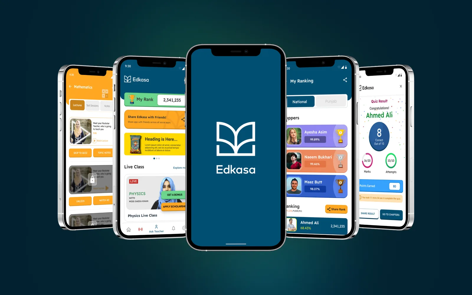
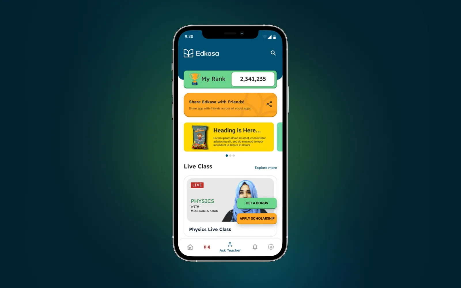
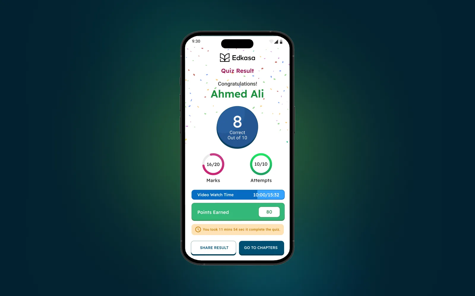
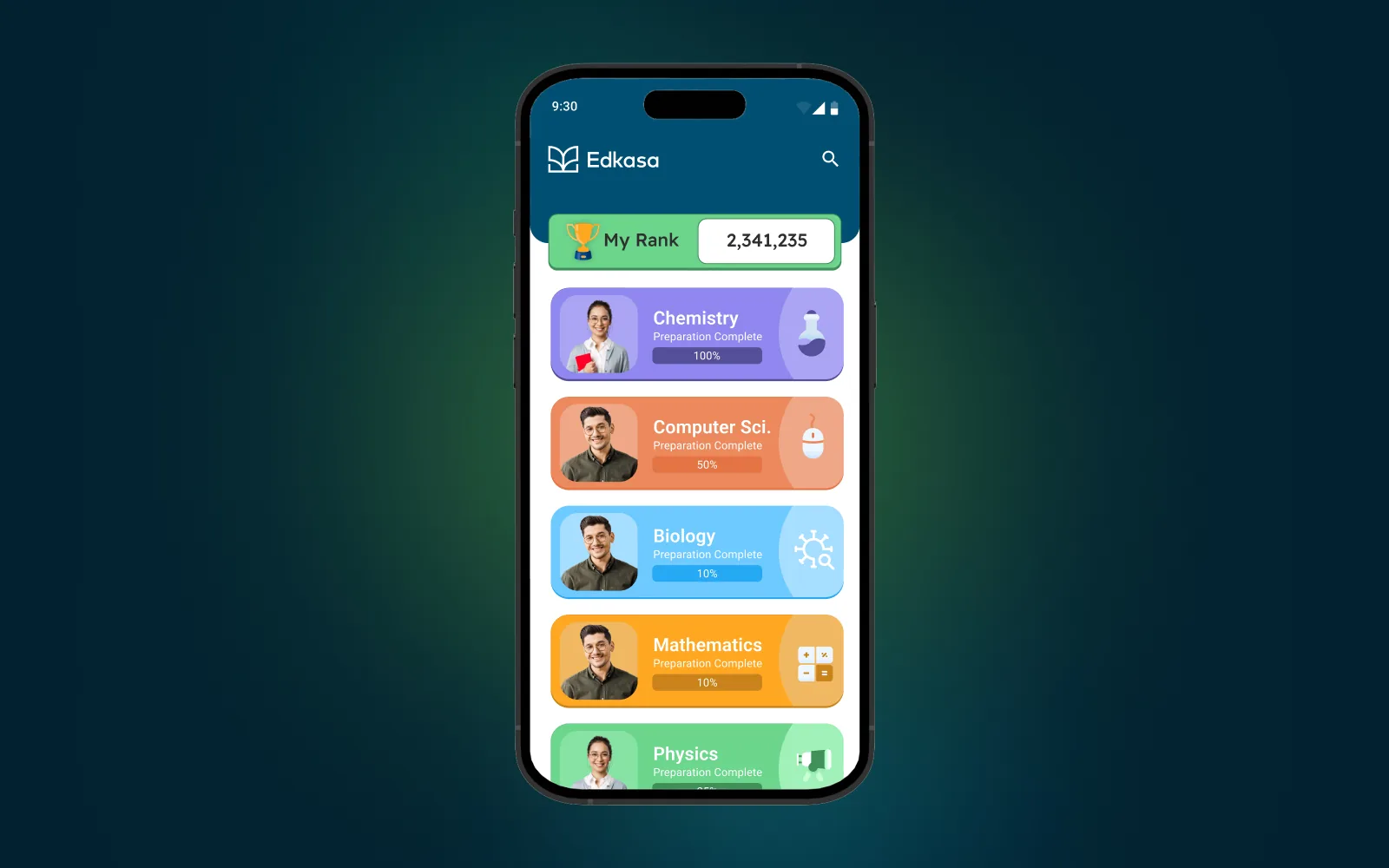
- Made preparation progress, report-card data, rankings, and points visible so students could understand their performance at a glance and feel a stronger sense of momentum.
- Introduced motivational patterns — including gamification, rankings, quiz results, and shareable achievements — without allowing the competitive layer to overpower the learning experience.
- Designed personalized subject and learning pathways, while adding interactive touchpoints such as teacher questions, notifications, live sessions, and upcoming bookings.
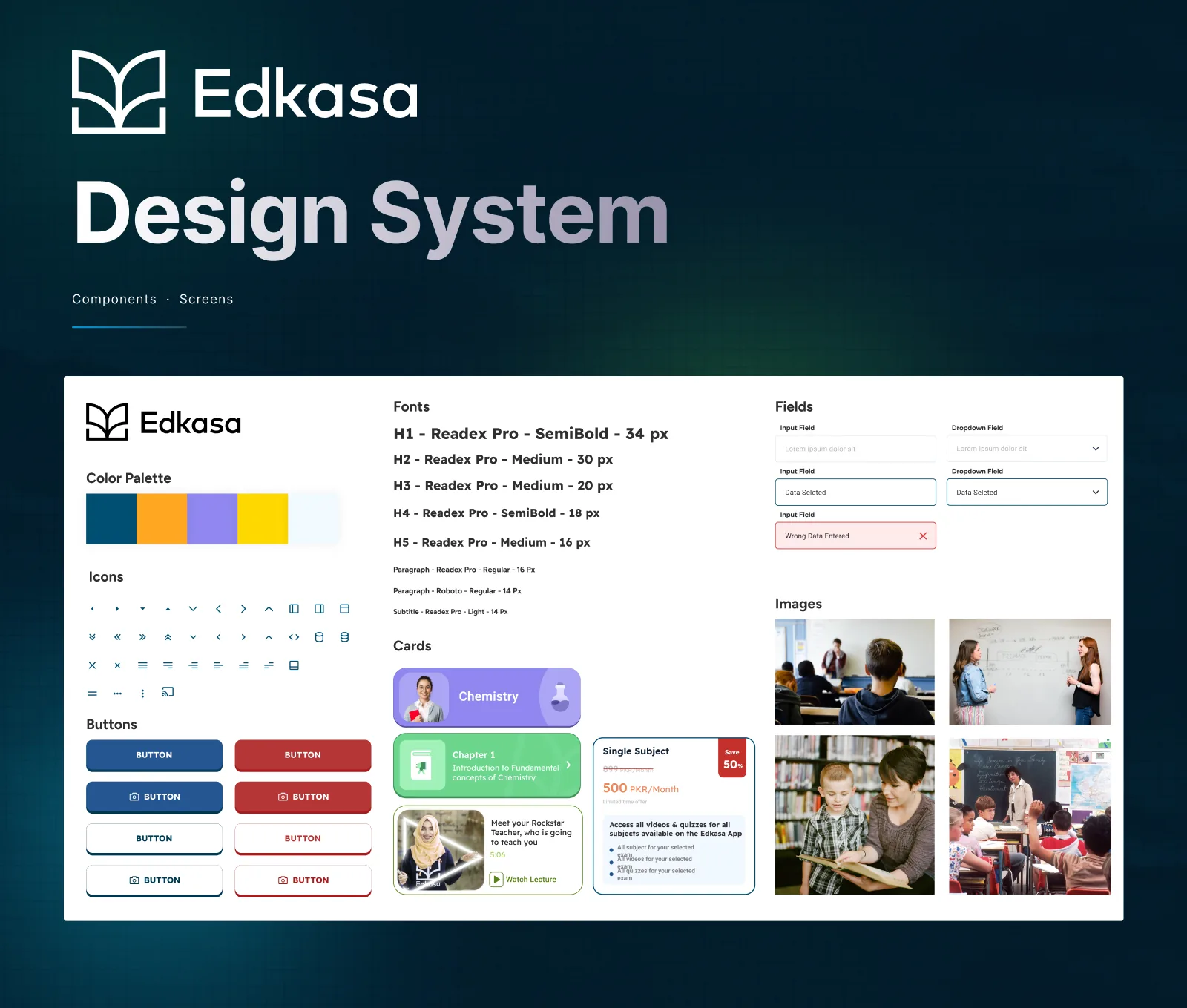
- Built the design system in parallel with the product so typography, color, icons, cards, fields, buttons, and states stayed consistent as the app expanded.
- Designed for both iOS and Android and considered future platform expansion, rather than treating the work as a set of isolated screens.
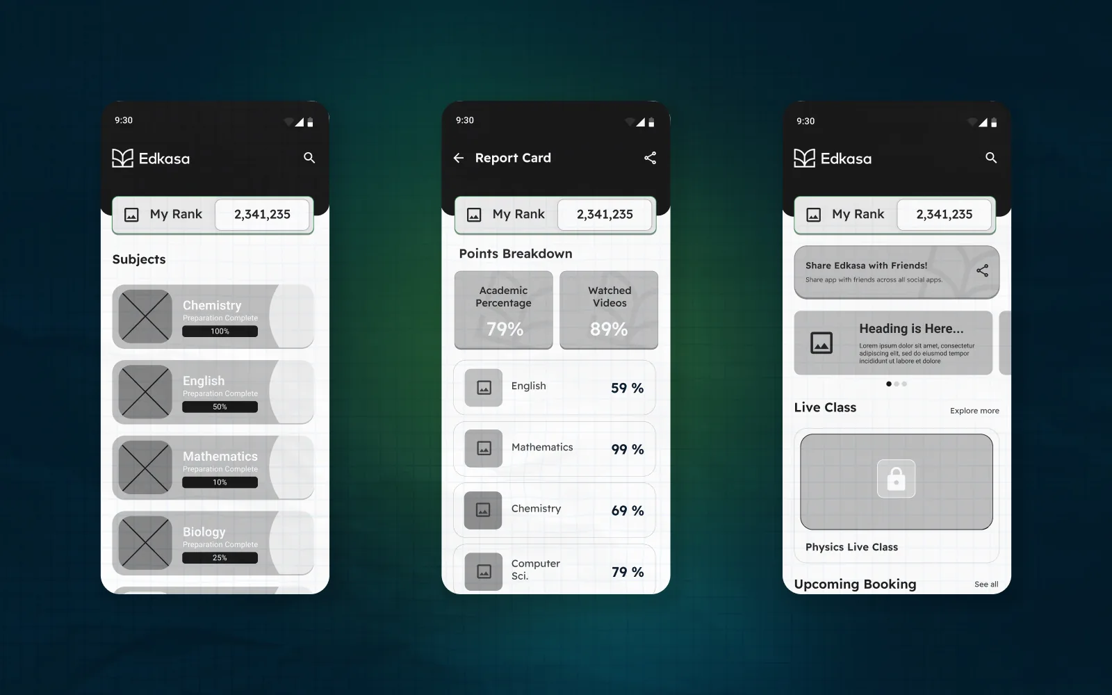
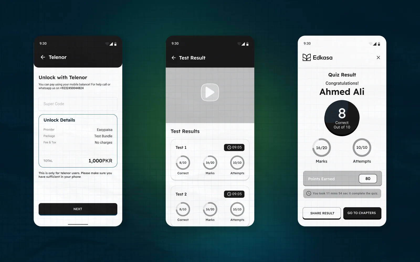
Design System
Brief Design System Visual for Edkasa
What shipped
A redesigned mobile learning experience covering the home dashboard, subject preparation, lesson and chapter views, tests and quiz results, report cards, national rankings, live classes, teacher support, notifications, package selection, payment flows, and social sharing.
The final delivery also included a reusable design system and high-fidelity prototypes that gave the development team a consistent foundation for the core product and future features.
Impact
The work replaced a fragmented experience with a more coherent product structure and gave the team a scalable visual and interaction system for future releases. Progress, performance, and live learning became central parts of the experience rather than hidden or disconnected features.
Post-launch conversion, retention, and usability metrics weren’t captured for this work. The documented outcome is the delivery of a unified end-to-end redesign for a platform already serving thousands of learners and recording 1.3 million hours of viewing time.